PROGRAM_ Promo, Branding
CLIENT_ Starbucks
CATEGORY_ Print Media, Promo Items, Packaging
STATUS_ Complete
CONTRACT_ Graphic Design
CREDITS_ Assoc. R.Lo
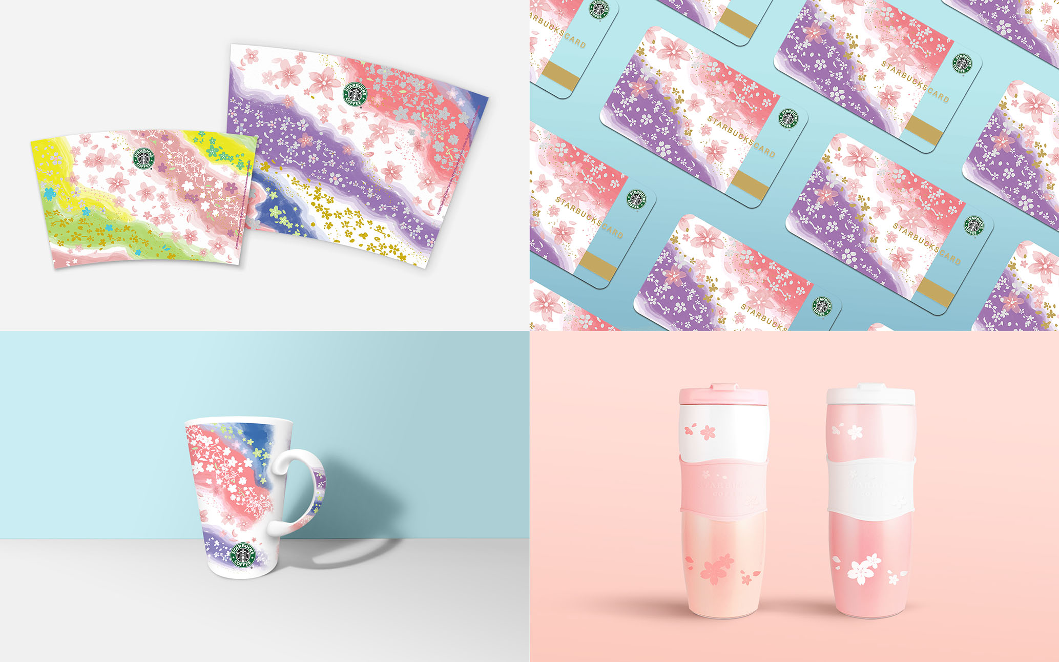
Starbucks’ Sakura promotion of 2010-2011; getting into the festive spirit!
To express the concept, and the spirit of Sakura in it’s cultural significance and representation, that is one of mindfulness, living in the present moment and of renewed growth, a combination of layering, soft watercolors and vibrant natural colors was combined.
The focal design strategy, was to balance the choice of colors first, then layer them so that from varying angles of viewing, they would flow ever so slightly.
Highlighting off with metallic golden branches, this provides an appealing contrast to soft leaves of watercolors, a silent acknowledgement to traditional Japanese embroidery works where Sakura flower motifs frequent.


