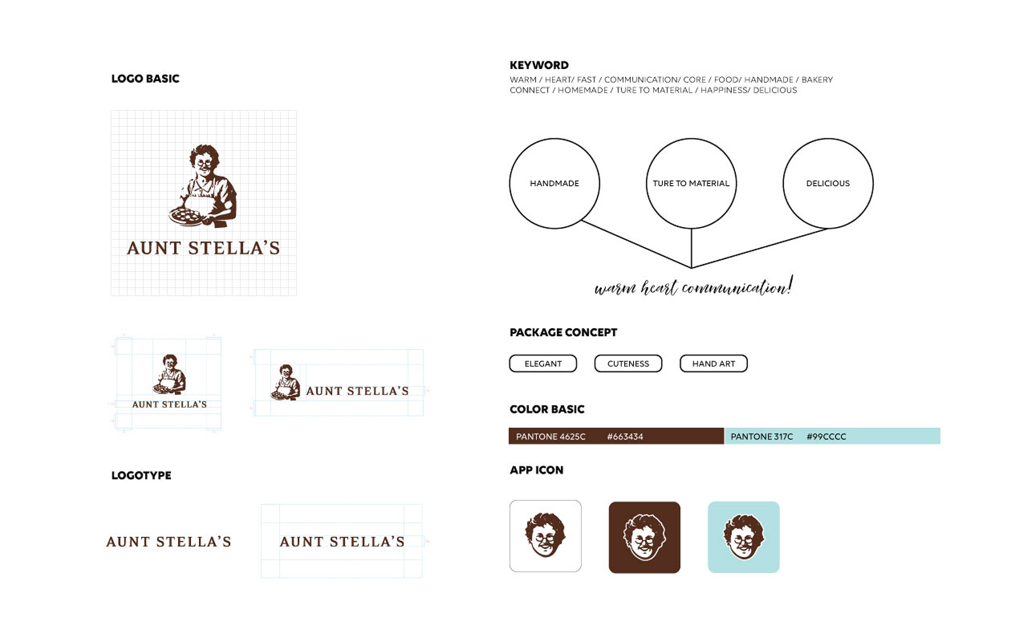
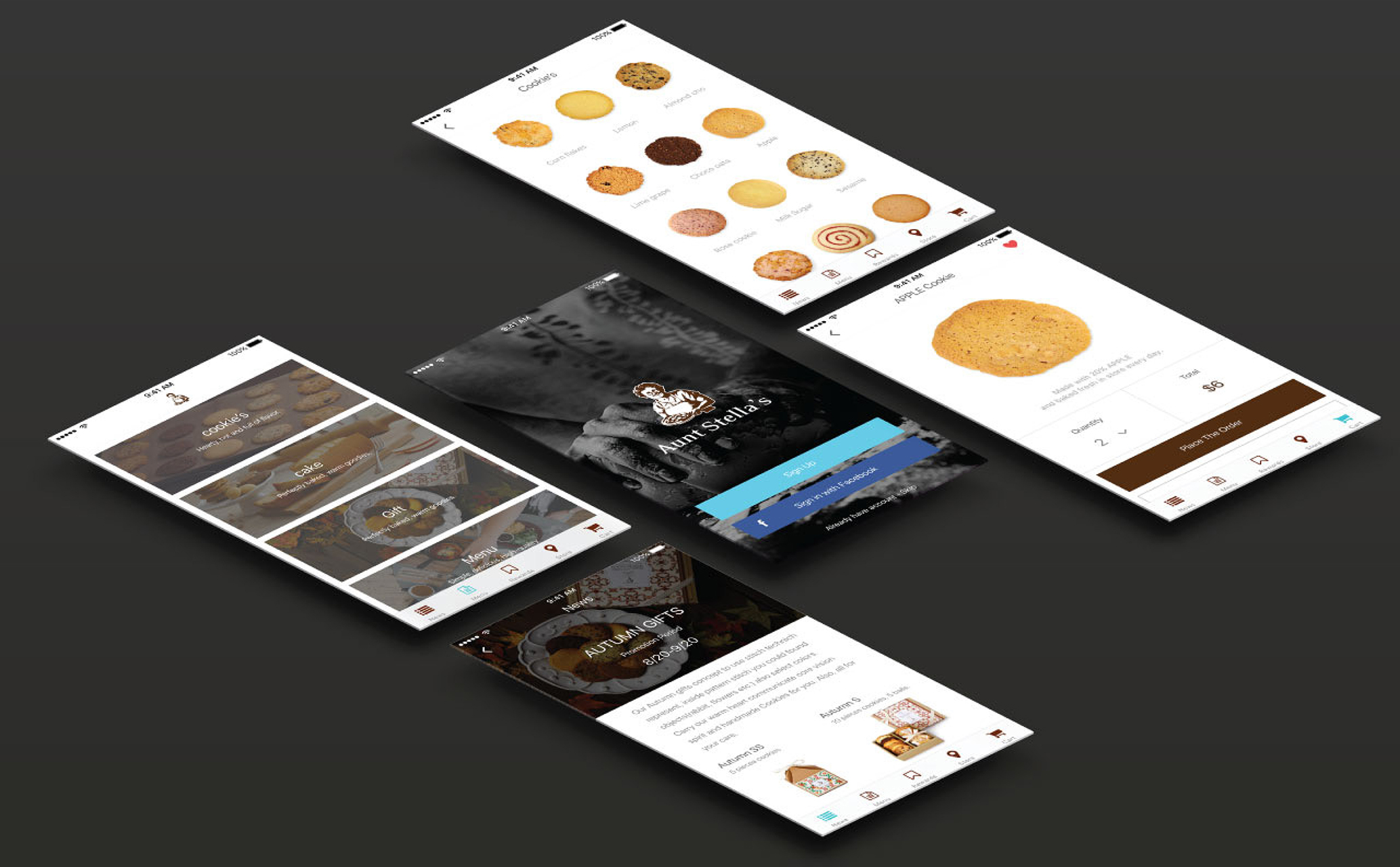
PROGRAM_ Visual Identity & Corporate Identity, Branding, Web, Mobile
CLIENT_ Aunt Stella’s
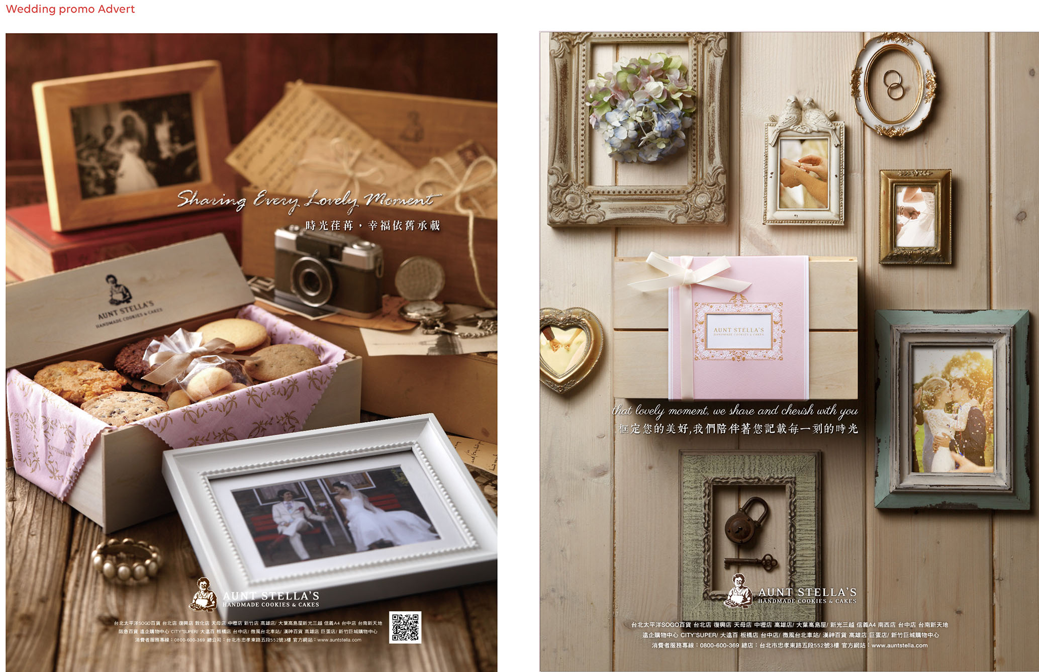
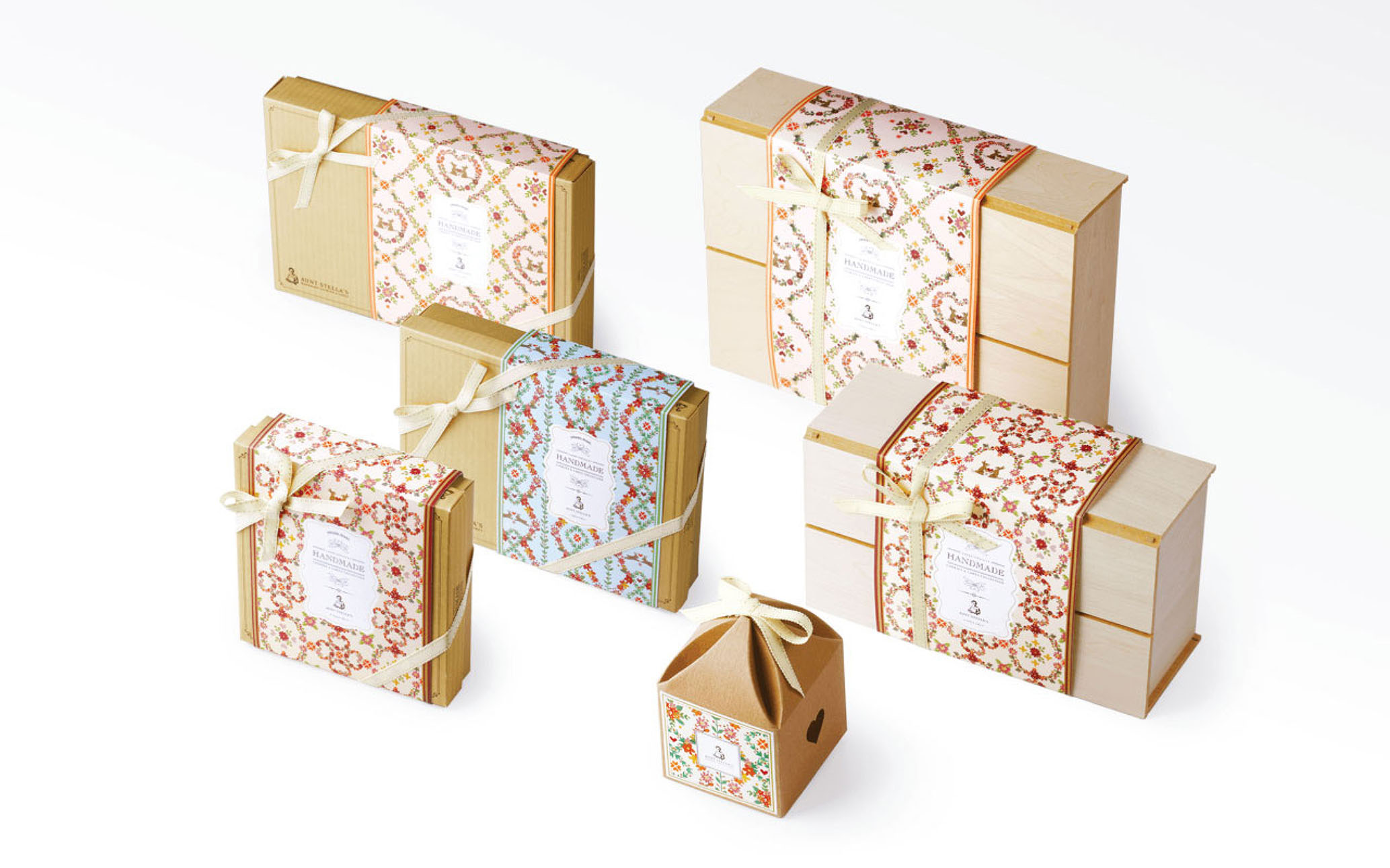
CATEGORY_ Print Media, Digital, Packaging
STATUS_ Complete
CONTRACT_ Graphic Design
CREDITS_ Assoc. R.Lo
The project consisted of creating a concept of spring, summer and autumn,
key words being warmth, growth and glow.
Keeping to that tradition, tools to achieve this were to use watercolor techniques to represent the visuals. Color showing lightness, soft and earthen textures.
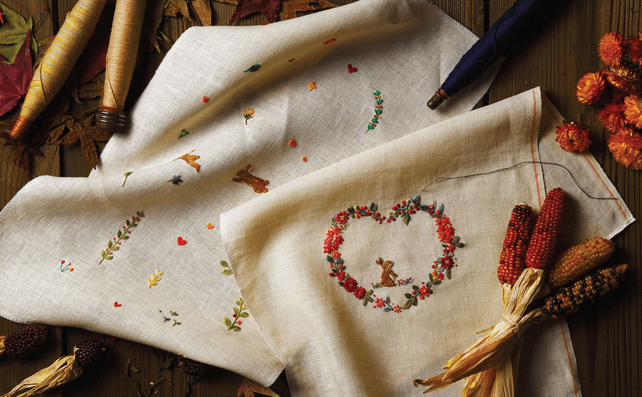
Hand artworks, as well as hand-crafted items embody the nature of the brand.
Market, season and celebratory events (Moon Festival) observed in Taiwan, we employed specific motifs within the embroidery design to reflect the cultural integration as well the brand’s market sensitivity to their clients.


